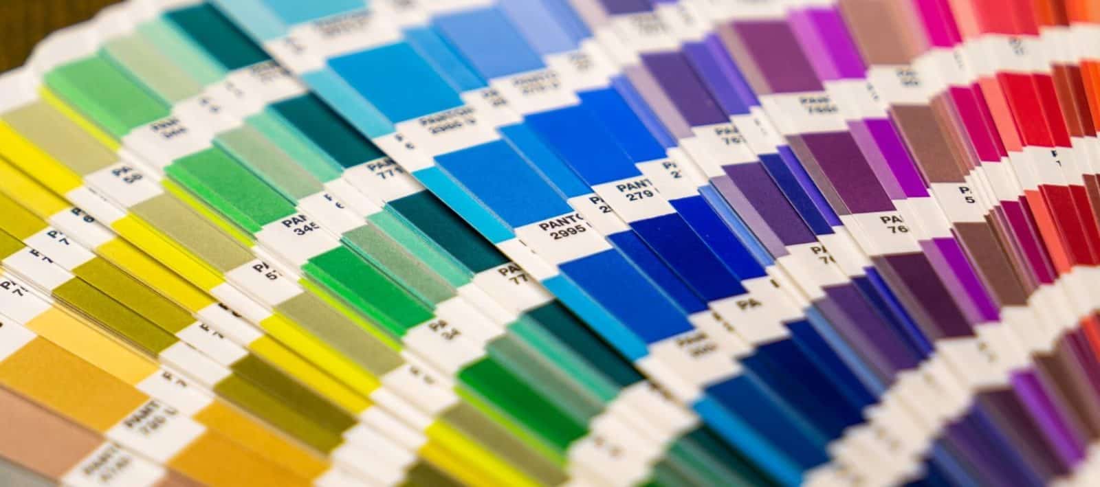
As a designer, you will inevitably find yourself needing to buy a Pantone color guide (swatch book). When that time comes you will probably be overwhelmed by what one to get. It’s a common question we see in Facebook groups all the time.
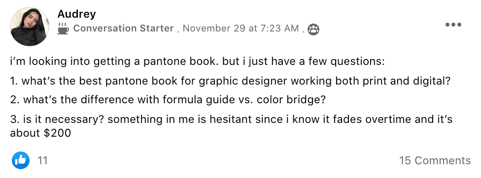
First, let us answer Audrey’s questions:

The Color Bridge Guide is the best Pantone swatch book for designers who mostly do digital work but sometimes do print work. It allows you to convert to values for both print and digital. The print colors are going to be less bold than if you got a print-focused color guide but they will be more affordable to print. If you are designing for digital and using Pantone colors it’s the only book you should buy.

Just because you spend most of your time in front of a laptop or computer doesn’t mean that having a physical Gamut Color Guide nearby is a bad thing. The Pantone GG700 is a gamut color fan guide that offers perspectives and information.
The colors can be compared with heightened accuracy. Each color and shade comes with screen tint percentages. You’ll see them as you would under D50 lighting conditions.
This particular matching system was also envisioned as a tool for CMYK printing. And, with the relative light weight of this fan guide, you won’t have to leave your office without it.

If you’re looking to match both coated and uncoated colors and to really understand the effects of printing on each color, this could be the Pantone matching color guide for you.
The Pantone Colored Bridge Set Coated & Uncoated is ideal for use in digital printing and press printing due to the detailed color reproductions. 112 new Pantone colors have been added to the previous guide for an even more in-depth overview.
This guide is best used for logo design, branding, web page design, artwork, printed consumer goods, and many more. The total of 1,867 Pantone solid color choices is impressive, as are the detailed guide and indicator codes.

If most of your work involves Pantone spot colors, then a formula guide set is what you need. This is a cheaper version of most bridge guides but it’s still highly useful for coated and uncoated printing.
1,867 colors are represented in solid colors and ink formulations. Although the paper is on the thinner side, it’s still good quality and shouldn’t affect your color calibration.
What’s also nice is that this Pantone Formula Guide Set will give you a better visual understanding of the differences between CMYK printing and spot color printing. And of course, save you some money in the long run.

Metallic colors are all the rage these days in certain quarters. That’s why Pantone LLC offers a very detailed guide as part of its Plus Series color bridges. The Premium Metallics Guide contains 300 metallic colors all arranged in a chromatic fan format for easy association and matching.
For those who work with special-effect inks, this guide may be the key to always finding the perfect color combinations. Note that this is also a coated color guide that should offer even more impact and detail.
As is the case with many fan books, the paper is a bit thin. You may want to use the guide’s storage box, especially for traveling purposes. Also, this guide may not handle long-term light exposure too well. You may need to replace it every year or so.

Equipped with 200 additional colors, the Pantone FHIP310N color guide will help you navigate the world of metallic and pearlescent finishes. Each card or page will feature a single full-bleed color.
The nitro-cellulous coating is of high quality. You’ll also notice that each page comes with a textile paper – metallic suffix. This should indicate the corresponding color in the fashion, home, and interiors matching system.
If your design work revolves around homes or the fashion industry, then this is a guide that should provide a lot of help. Not just because it can help improve your color communication skills but also because it promotes palette development. Something valuable to any graphic designer.

If you’re looking for the best of both worlds, then you’ll probably need to have both a chip guide and a fan guide on hand at all times. The Pantone GP1608N solid color guide set has 112 new Pantone color representations and two guide formats.
It also offers both coated and uncoated matching guides. It’s as extensive as a guide can get, although it’s also quite expensive. For all intents and purposes, it’s all about the convenience of having access to multiple matching systems at all times.
With this color set, your color matching process won’t have to suffer and you’ll always be able to have a solid idea of what to print on coated and uncoated stocks.

Not all graphic designers spend all their time in front of a monitor. If you’re the type of artist who also gives presentations, then you’ll need the assistance of a Pantone Chip Book. This one has 1,867 solid Pantone color representations.
Each chip is removable and replacement chips are offered as a package deal. You can use this to show your clients the colors as they’ll look in coated and uncoated stock printing applications.
This Pantone Chip Book would be great for presentations, design concepts, product planning, printed packaging, logo design, and so on.

This chip book isn’t just convenient to use but it’s also very helpful. You just won’t find this unique matching system in most other Pantone color guides. If you work with pastel colors and neon colors, you’re going to need a proper color guide that can provide accurate comparisons.
The chips feature unique Pantone number identifiers for easy cross-checking. The binder pages are removable and replaceable. However, the book doesn’t come with replacement pages. So, keep that in mind when tearing out the chips for presentations or personal use.
The loose-leaf format of this pastel and neon chip book does make the book a bit bulky and perhaps not the best travel companion. However, the quality of the paper and cover should make it more rigid and durable than other color guides.
If you need more info on what system to choose we suggest looking at Pantone’s website.
The Daily Logo Challenge is supported by readers. As an Amazon Associate I earn from qualifying purchases. If you click on links on our site it is possible we will earn an affiliate commission. This helps pay for the costs of the logo challenge.